Friday, 23 October 2015

Target Audience

In today's lesson, we understood the importance of customer profiling in order to understand your target audience in more detail. Customer profiling is a way to create a portrait of your customers to help you make design decisions for your magazine; it is a technique to attract more customers. The target audience is separated into different segments, which are Demographic and Psychographic. Demographic profiling is a marketing strategy which divides customers into demographic factors such as age, gender, race and working class. This technique may not be the best because it is not specific enough, for example not every male customers under 18 would want a certain chocolate bar or an iPhone. Psychographic profiling is dividing the target audience into common interests, activities, opinions and attitudes. This is a more detailed strategy which may be more useful.


The target audience is also separated into different social classes, these are groups are labelled A, B, C1, C2, C3, D and E.  The A group consists of the higher, upper class customers whereas the E group consists of lower class, unemployed customers. Different adverts and products appeal to different social groups. For example, a chocolate advert which portrays chocolate in an "elegant" way would appeal more to group A customers, but chocolate portrayed as "cheap and cheeky" would appeal more to group E customers.


As you can see, the magazines above are targeted towards different target audiences. Seventeen is a beauty/gossip magazine which is aimed towards younger teenagers, you can identify certain features such as the use of bright colours and the choice of cover model. Rihanna, a pop singer has been chosen because she is very popular within young female teenagers who listen to her music. On the other hand, Marie Claire is a fashion magazine which is aimed towards older customers who are interested in fashion. The colours used are not bright, but are more darker and sophisticated. It looks more attractive towards adults.

Friday, 9 October 2015

My Final magazine front cover

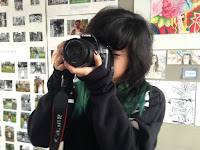
For my final school magazine cover, I have improved a few features from my mock up version such as the cover lines and the central image. For the central image, I changed the shirt of the cover model into a green camouflage shirt instead of a black one because it matches with the style of the magazine more. I chose different shades of green on the front cover to represent the artistic side of the students, in addition the hair of the cover model matches the magazine. I kept the positioning of the camera the same because it shows how passionate the students are about art, in this case photography.

I have changed some of the cover lines on the front cover. I changed one into "Enjoy the present, succeed in the future" because it conveys that the students will succeed in their art careers in the future, while enjoying their education during their teenage years. This cover line portrays the school as an enjoyable working environment, while also providing a great education for the students.

Another feature I changed was one of the anchorages into "Passion for Fashion" which is written in big, green font to make it more eye catching for the audience. I chose this anchorage because it shows how students are passionate about the subjects in the school. It will attract any one who enjoys Fashion and may persuade them to join the school.  


Thursday, 8 October 2015

Planning my photoshoot

For my photo-shoot, I will be taking pictures of Eloise as she will be the cover model for my school magazine front cover. In the front cover, she will be holding a camera in front of her face. Because my school will be an art school, I want to present the school as artistic and talented by using one of the students as the cover model.

I chose Eloise to be the cover model because she looks artistic, in addition her green hair suits the color of my magazine. She will be wearing a black shirt to contrast the color green; the background of my magazine will also be black. I am choosing these colors because they work well together, they do not clash and are not too tacky.  

My photo-shoot will take place in the art rooms because it shows that the students are surrounded in an artistic environment; I will use lighting on Eloise's face so it is more exposed and good quality. The central image has to be engaging so I will use a close up shot of her using the camera, it captures more detail in the picture.


Wednesday, 7 October 2015

Deconstruction of Heat magazine cover.

Gossip magazines are designed to exploit stories about celebrities to the public, usually to embarrass the celebrity or to portray them in a negative way. This is done for entertainment; the consumers of gossip magazines enjoy reading about gossip and to keep updated about the lives of celebrities.

In today's lesson, we analysed the front cover of Heat magazine (which is a gossip magazine published by Bauer). Like every other magazine, the front cover includes conventions which attract the customers to buy. One of the most common convention is the central image, this tends to be an embarrassing photo of the celebrity along with an engaging anchorage to lure the readers into buying the magazine. As you can see below, a picture of Lauren is used looking depressed with the quote "I can't stop eating..." as the anchorage. This is purposely chosen to be the central image because it attracts the customers to want to know more about the story.


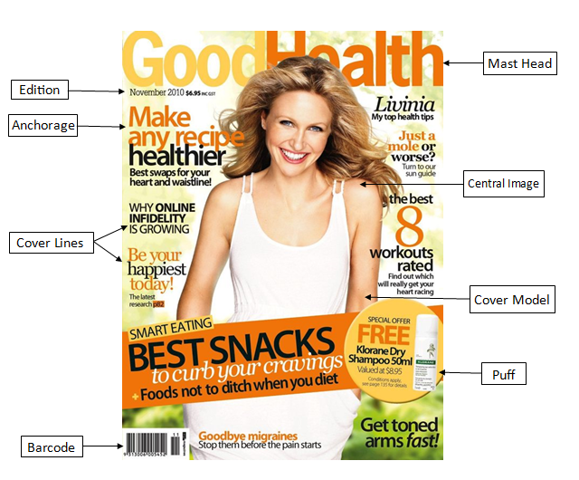
Annotations for non-music magazines