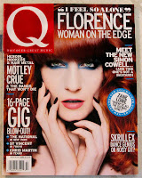
In our lesson yesterday, we learnt all of the features which are included in a magazine cover; these features are included in every single magazine cover and are known as a "convention". A convention is what's considered the "normal" or "common". Some examples of these conventions are the mast head, central image and tagline; these are all common in a magazine cover. The main purposes of these conventions are to attract a certain type of target audience and to persuade customers to buy the magazine. In the magazine industry, every centimetre of the magazine has to be used up to attract customers.
Firstly, the most important feature of a magazine cover is the mast head. This is the name of the magazine which is always placed at the top in huge, bold writing. Here are some examples of mast heads:
As you can see, the mast head for Kerrang is very noticeable as it is very big and it is what stands out the most in the magazine, in addition the colour of the mast head contrasts with the background so it is more visible to the costumer. Likewise for the Vogue magazine, the mast head is in bright red so that the costumer is more likely to see it.
Another convention which is very important to the front cover is the central image; this is the image that catches the readers' eye before reading the printed text. The central image has to be appropriate to what is inside the magazine because it will be featured in the main article. In addition to it's importance, it is most likely what will attract the customer to buy the magazine because the image will be very eye catching to a certain target audience.


As you can see, the central images on these magazine covers are very eye catching and will attract a certain audience. For example, the Fashion magazine includes a picture of a model wearing a trendy dress with the tagline "Spring shopping made easy". This will obviously attract a lot of female audiences who are interested in fashion or what is in the latest trends; this central image is chosen because it will make females feel like this is what they should look like, therefore they feel attracted to buy it. Likewise with the Men's Health magazine, the central image is chosen because it will attract male audiences to buy it because it is what they want to look like. Along with the tagline "Build a beach body", this will attract males to buy the magazine because it is engaging.
Another convention of a magazine is the tagline, which is usually found near the mast head. The tagline represents what the magazine is about and who it might be aimed for. For example, the tagline for Q magazine is "discover great music" which is just underneath the mast head. The customer will know that this magazine is aimed towards people who have a taste in music or for anyone who wants to find new music. Another example of a tagline is "Anime, Asian, Film, Manga, Games" for Neo magazine which will persuade anyone to buy the magazine if they like any of the things on the tagline. In my opinion, it is a good tagline because it presents what is included inside the magazine as well as attracting costumers to buy it.


Other conventions of a magazine include anchorage, secondary images, coverlines, puffs and pugs. An anchorage is a term that refers to how images are referred to. In magazines, images will be anchored by captions (directly explaining what the pictures depict), by coverlines, or by articles and headlines. An example of anchorage is "The World's Greatest Actor" on the cover of Time magazine. This appeals to the audience because there is more context inside the magazine, so it will make them want to read it. Also, it is written in bold font and the word "greatest" is specifically highlighted in red so it is emphasised more.


The Digital Photographer magazine shown above contains a pug and puff. The pug is located at the top left corner of the magazine and the puff is a device which helps to draw attention and to promote certain elements in the magazine, this often advertises "freebies". The pug on the cover says "Free CD" which will automatically attract a customer to buy it as it is free, in addition the puff says "Plus! Restore old images" which connects to the pug. Both of these features are more techniques to persuade a customer to buy magazines.


