Fader and Clash are music magazines, i-D is an arts & culture magazine and Violet is business magazine. Music magazines are not the only influential designs I have looked at, I think that the 2 non music magazines look just as appealing as the 2 music magazines. I think these cover designs look appealing because they are simplistic, but still eye catching. I want to go for a similar design for my music magazine because I would want to attract a similar readership as these magazines. These magazines are not the most popular within the industry, unlike Kerrang and NME, for example. However, I still think that these magazines have a very dedicated customer base and they contain quality content. These magazines do not conform to the conventions, for example they do not contain puffs, pugs and lots of coverlines. It's minimal and effective.
Sunday, 27 December 2015
Magazine covers that have influenced me
I have researched several magazine covers for inspiration whilst trying to design my own magazine cover; here are some of the magazine covers that I think look very appealing:
Thursday, 17 December 2015
Front cover / 2nd mock-up
Another feature I have changed is that I have enhanced the cover line which says "FRANCIS BASCO, solo artist of the year" by making it larger and closer to his face. Since he is the cover model and central image for my magazine cover, it is very important to portray his name as the most bold coverline so that the readers identify who he is and his importance in the front cover. In the previous mock up, his name was smaller and it was located near his arms which shows that it is not the most vital article in the magazine, so to improve it I have made the text a lot larger, made the font red and placed in closer to his face. In addition to this, I have also made the coverlines more compacted so that the reader can clearly tell where the coverlines separate.
In terms of the price of the magazine, a few respondents have said that the price was too high but others have said that the price was good and said that it was "a bargain". I have changed the price of my magazine from £3.50 to £2.99 to meet the demands of some of my consumers, however if this price is not appropriate for my magazine then will will change it again. Usually, the price determines the quality of a magazine so I do not want a price that is too low or too high that my target audience cannot afford it. I am trying to find the most appropriate price for my consumers, as well as portraying that my magazine is not low quality.
I will make further improvements to this mock-up cover after gaining some more feedback.
Wednesday, 16 December 2015
Wednesday, 2 December 2015
Semiotic analysis of my mock up front cover.
I have designed and produced the first mock up for my indie music magazine; the style of the magazine is very simplistic and minimal which includes other conventions of a magazine. There are several reasons why I have chosen each design of the magazine:
Masthead —The masthead of my magazine is called “Indigo”, there are several reasons why I chose this name as well as the design of the logo. Indigo is a dark blue-violet colour which is often described as “deep midnight blue”. According to my questionnaire, a lot of people associate indie music with dark colours therefore indigo is an appropriate colour to use. In addition to this, indigo is a unique name because it is short and simple but also sounds similar to “indie” which will convey the type of genre my music magazine is. I have decided to go for a simple and minimalistic design which is why I have simply have a rectangular box around the name, I have chosen this design because indie is often considered as a different and unique genre of music, therefore the design of my masthead will also be unique. Unlike other music magazines which have wild colourful mastheads, I have a different design which looks simple and eye-catching. The name of the magazine is inside a box so that the readers can easily see what is inside it; the name is in the centre of the box so that it stands out more. The colour of the masthead is plain white because it contrasts well with the background which is black. In addition, I have chosen to use a black and white design for the front cover because a lot of respondents from the questionnaire have said that they prefer black and white as the two main colours which are associated with indie music. I am trying to provide and attract my target audience by applying the answers that they have provided me for the music magazine. The font size of the masthead is fairly large because the masthead is obviously one of the most important conventions of a magazine, therefore it must be the first thing that the readers see when they look for it in a shop. I have put the masthead on the top left corner of the front cover because this is the normal convention of a magazine cover; usually when a customer goes into a shop and searches for a magazine, they would be placed in way that you cannot see the bottom of the magazine. It is simply because the top of the magazine would be the first thing that the reader would see on the shelf, in addition most readers visually scan things from left to right so it would be more beneficial if the masthead is placed on the left side rather than the right.
Tagline - The tagline of my magazine is "indie music at its finest"; I have chosen this tagline because it is a quick and simple way of conveying what the genre of my magazine is. When a reader first comes across the magazine, they may not know what type of magazine it is so by looking at the tagline they will have a clear understanding of what they will find inside the magazine. It also conveys to the reader that the artists/songs inside the magazine is very high quality because I have chosen the word "finest" which is associated with prestige and upper class. This will attract a lot of customers who are looking for good quality indie music. The size of the tagline is very small compared to the mast head because I do not want the readers to be distracted from the name of the magazine; if the tagline was the same size as the masthead then it would be harder to identify which one is the masthead and which one is the tagline. However, I have chosen to put the tagline just underneath the mast head so the readers will still understand what genre is the magazine and what it is about.
Cover Model - The cover model I have chosen for my magazine is Taylor Rice, who is the lead singer of the indie band Local Natives. I have chosen him because he is obviously an indie artist, in addition anyone who listens to this band will feel attracted to buy the magazine, especially if they are a huge fan. The cover model is a way of attracting customers so I have chosen an appropriate person that would suit the genre. The cover model's facial expression is of him singing which portrays that he is a singer and how he is passionate to sing. His face takes up the majority of the page because it conveys how important he is and how he is relevant to the genre of the magazine. In a magazine, the central image must take up as much of the page as possible, I have done this by cropping the full image and enlarging the part of the image which I will use. I made sure to include his hairstyle as well because it is different from most other music artists. This ensures that the indie style is unique.
Monday, 30 November 2015
Planning my photoshoot
For the photo-shoot of my magazine cover, I have chosen Francis to be the cover model because I think he is appropriate for the genre of my magazine. The cover model is in the same age group as me and the target audience, therefore it will appeal to the right readers instead of younger audiences which are not my main target. The outfit that I think he should wear is either black, white or red clothing because these colours are the most popular options which are associated with indie music according to the results in my questionnaire. In addition to this, Francis will be wearing a beanie because it is a popular accessory within indie artists and it will convey what type of genre my magazine is. I have taken inspiration from indie artists such as Last Dinosaurs and Chet Faker:
The location of my photo-shoot will take place outdoors because the lighting is better when natural light is used; specifically it will take place in the garden area outside the chapel. My cover model will be holding an acoustic guitar to show the readers that he is a musician. In addition to this, his facial expressions will be of him singing to show that he is passionate about music.
During the photo-shoot, I will take several pictures to try and capture the way he is playing the guitar and singing. I will also capture the outfit he is wearing, this means that I will take mid-shots as well as close-ups to focus on his facial expressions. A full body shot will also be taking so that his full outfit will be seen; he will also model with the guitar to show that he is a musician. After the photo-shoot, I will choose the top 5 (or 3) pictures which I will use for the front cover of my magazine. During the editing process, I will experiment with the pictures by adding black and white filters to identify which will look better for an indie music magazine.
In terms of equipment, here is a list of all the items I will bring to the photo-shoot:
- DSLR camera
- Tripod
- Acoustic guitar
- Beanie
- Outfit of my cover model
- Umbrella (in case it rains)
Saturday, 28 November 2015
Questionnaire analysis
I have asked 10 respondents to fill out my questionnaire and analysed the results; half of the people I asked were boys and the other half were girls, this is because there is not specific gender which falls into the music genre indie. In addition, the 10 people were all in the age group of 15-24 because I feel that this is the right age group who would listen to indie music and read my music magazine. I did not ask for the name of the respondent as this is not necessary.
One of the first main questions that would influence the front cover of my magazine is the artists which I should use, therefore I asked the question "who are your favorite artists / bands?". The feedback I received benefited me because I can use the respondents' favorite artists on my front cover as one of the cover lines, for example one of the artists were Arctic Monkeys so I could perhaps include "Arctic Monkeys comeback concert in London!" as one of the cover lines which would attract a lot of consumers who also listen to this band. One of the advantages of asking people who listen to indie music is that they can all relate to the same music tastes, which would help me choose and improve the front cover of my magazine as I can combine the information I received from the questionnaires. One of the reasons why I asked this question is to get an understanding of what artists will appeal to my target audience, and to persuade them to buy the magazine once it has been designed. The cover lines is an important convention because it attracts customers when they first see the magazine, this means the right bands must be chosen to appeal to them. Other artists written down include Ed Sheeran, Crossfaith, Delta Spirit and Twenty One Pilots, which could have also been used in the cover lines.
Another important question I asked is "What is the most important part of a magazine?" which was followed by 8 options including Events, Competitions, Advertisements, Gossip, Interviews, Freebies, Articles and Advice. The respondents were given the choice to choose two options out of the eight. The reason I included this question is to get an idea of what I can include as a puff, pug or cover lines to attract customers who enjoy indie music. The majority of my respondents ticked either "interviews", "freebies" and "events"; I can use this information to apply to my front cover. I can include cover lines such as "Exclusive interview with..." to attract readers who are a fan of a certain artist/band. I can relate this to the previous question and combine it to use something like "exclusive interview with Arctic Monkeys" which would appeal to readers even more.
The name and color of my magazine is one of the most important features, this is why I asked "What name would you give an indie magazine?" as well as "what colors would you like to see on an indie music magazine?" followed by 14 different options with a range of colors. I gave the respondents a range of colours such as black, white, indigo, gold, burgundy etc. so that I can have a more diverse result and identify which color is the most common. When I got the results, it turns out that the most common color chosen was black, white and blue; I will use these colors on my front cover. In terms of the name of my magazine, I got a lot of feedback with names such as "Vibe", "Indigo"and "Wave" which are all decent names for an indie magazine.
Wednesday, 18 November 2015
Monday, 16 November 2015
Prezi
I decided to use different media platforms to convey my analysis, instead of just regular blog posts. I used the website Prezi which uses slide shows to present information. I think that this is a useful and effective website because it is different from a blog post.
I decided to analyse an advert from a magazine.
I decided to analyse an advert from a magazine.
Tuesday, 10 November 2015
Lifestyle Questionnaire
This questionnaire is intended for my target audience to fill out; it has relevent questions which will be linked t the creation of my magazine front cover. The results for this questionnaire will give me a clear outline of the features I will include in my front cover.
Monday, 2 November 2015
Customer Profile & Imaginary Entity
The target audience for my music magazine will consist of a wide range of people of different ages, genders and interests. The intended age group that I am aiming towards is 16-25 as I feel like these age groups will have an appreciation for the genre of music I have chosen, which is indie. There is no specific gender as this genre of music does not appeal to only one gender. In addition, my target audience will most likely be interested in a wide variety of indie artists, these include singers, bands and producers. The main socio-economic group who would read this magazine are C2, E and D.
Imaginary Entity
Lena is a 19 year old University student who studies screenwriting at the University of Arts in London; she enjoys reading crime-thriller books as well as watching movies. She likes to socialize with her friendship group, however she does not enjoy large crowds. Music is a big part of her life as she has been listening to a wide range of music artists since she was younger; her current favorite genre of music is indie and her favorite bands are The xx, Wolf Alice and Local Natives. The most important parts of music, according to Lena, are lyrics, vocals and style. On an average year, she spends about £200 on music-related products including albums, concert tickets and merchandise. Lena discovers new artists through Youtube, Soundcloud and through her friends.
Friday, 23 October 2015
Target Audience
In today's lesson, we understood the importance of customer profiling in order to understand your target audience in more detail. Customer profiling is a way to create a portrait of your customers to help you make design decisions for your magazine; it is a technique to attract more customers. The target audience is separated into different segments, which are Demographic and Psychographic. Demographic profiling is a marketing strategy which divides customers into demographic factors such as age, gender, race and working class. This technique may not be the best because it is not specific enough, for example not every male customers under 18 would want a certain chocolate bar or an iPhone. Psychographic profiling is dividing the target audience into common interests, activities, opinions and attitudes. This is a more detailed strategy which may be more useful.
The target audience is also separated into different social classes, these are groups are labelled A, B, C1, C2, C3, D and E. The A group consists of the higher, upper class customers whereas the E group consists of lower class, unemployed customers. Different adverts and products appeal to different social groups. For example, a chocolate advert which portrays chocolate in an "elegant" way would appeal more to group A customers, but chocolate portrayed as "cheap and cheeky" would appeal more to group E customers.
The target audience is also separated into different social classes, these are groups are labelled A, B, C1, C2, C3, D and E. The A group consists of the higher, upper class customers whereas the E group consists of lower class, unemployed customers. Different adverts and products appeal to different social groups. For example, a chocolate advert which portrays chocolate in an "elegant" way would appeal more to group A customers, but chocolate portrayed as "cheap and cheeky" would appeal more to group E customers.
As you can see, the magazines above are targeted towards different target audiences. Seventeen is a beauty/gossip magazine which is aimed towards younger teenagers, you can identify certain features such as the use of bright colours and the choice of cover model. Rihanna, a pop singer has been chosen because she is very popular within young female teenagers who listen to her music. On the other hand, Marie Claire is a fashion magazine which is aimed towards older customers who are interested in fashion. The colours used are not bright, but are more darker and sophisticated. It looks more attractive towards adults.
Friday, 16 October 2015
Friday, 9 October 2015
My Final magazine front cover
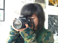
For my final school magazine cover, I have improved a few features from my mock up version such as the cover lines and the central image. For the central image, I changed the shirt of the cover model into a green camouflage shirt instead of a black one because it matches with the style of the magazine more. I chose different shades of green on the front cover to represent the artistic side of the students, in addition the hair of the cover model matches the magazine. I kept the positioning of the camera the same because it shows how passionate the students are about art, in this case photography.
I have changed some of the cover lines on the front cover. I changed one into "Enjoy the present, succeed in the future" because it conveys that the students will succeed in their art careers in the future, while enjoying their education during their teenage years. This cover line portrays the school as an enjoyable working environment, while also providing a great education for the students.
Another feature I changed was one of the anchorages into "Passion for Fashion" which is written in big, green font to make it more eye catching for the audience. I chose this anchorage because it shows how students are passionate about the subjects in the school. It will attract any one who enjoys Fashion and may persuade them to join the school.
Thursday, 8 October 2015
Planning my photoshoot
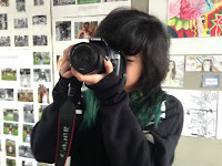
For my photo-shoot, I will be taking pictures of Eloise as she will be the cover model for my school magazine front cover. In the front cover, she will be holding a camera in front of her face. Because my school will be an art school, I want to present the school as artistic and talented by using one of the students as the cover model.
I chose Eloise to be the cover model because she looks artistic, in addition her green hair suits the color of my magazine. She will be wearing a black shirt to contrast the color green; the background of my magazine will also be black. I am choosing these colors because they work well together, they do not clash and are not too tacky.
My photo-shoot will take place in the art rooms because it shows that the students are surrounded in an artistic environment; I will use lighting on Eloise's face so it is more exposed and good quality. The central image has to be engaging so I will use a close up shot of her using the camera, it captures more detail in the picture.


Wednesday, 7 October 2015
Deconstruction of Heat magazine cover.
Gossip magazines are designed to exploit stories about celebrities to the public, usually to embarrass the celebrity or to portray them in a negative way. This is done for entertainment; the consumers of gossip magazines enjoy reading about gossip and to keep updated about the lives of celebrities.
 In today's lesson, we analysed the front cover of Heat magazine (which is a gossip magazine published by Bauer). Like every other magazine, the front cover includes conventions which attract the customers to buy. One of the most common convention is the central image, this tends to be an embarrassing photo of the celebrity along with an engaging anchorage to lure the readers into buying the magazine. As you can see below, a picture of Lauren is used looking depressed with the quote "I can't stop eating..." as the anchorage. This is purposely chosen to be the central image because it attracts the customers to want to know more about the story.
 In today's lesson, we analysed the front cover of Heat magazine (which is a gossip magazine published by Bauer). Like every other magazine, the front cover includes conventions which attract the customers to buy. One of the most common convention is the central image, this tends to be an embarrassing photo of the celebrity along with an engaging anchorage to lure the readers into buying the magazine. As you can see below, a picture of Lauren is used looking depressed with the quote "I can't stop eating..." as the anchorage. This is purposely chosen to be the central image because it attracts the customers to want to know more about the story.
Thursday, 1 October 2015
Tuesday, 22 September 2015
School Magazine
There are many differences between a magazine that is sold in shops and a school magazine; school magazines are not sold to customers however they are given out to individual students in school. There are certain conventions on a magazine that is not included in school magazines, for example barcodes are obviously not include as they are only given out to students, and are not sold to anyone else in public. Also, there will not be a lot of issues/editions as they are only made annually or every term.
On the other hand, a school magazine will include some similar features such as a mast head, central image and anchorage. As you can see from the image below, the mast head is "College" which is written in bold yellow text to make it stand out to the readers. The color of the mast head also contrasts with the background to make it more engaging to the reader. This will be one of the first things that the reader will see. In addition to the mast head, a central image will also be one of the first things to be seen by the reader.
In this magazine, an image of a student smiling is used. This is probably used to make the readers think that the school is very outstanding and enjoyable. The editors of the magazine chose a smart looking student to be on the center of the magazine, in addition they specifically positioned him like this whilst holding textbooks in one hand. The textbooks represent hard work and good study environment within the school, which may persuade readers to join the school. The cover model has to be chosen very carefully because they will be the one to represent the school. Every school magazine cover conveys the school in a positive way.
Both school magazines and other magazines sold in shops include anchorage and a pug. An anchorage is a term that refers to how images are referred to. The anchorage is usually around or beside the central image and tend to be written in bold or in colorful font. As you can see above, the anchorage says "Dancehall's Bright Future" and is written in bold yellow font, this is to attract the reader.
On the other hand, a school magazine will include some similar features such as a mast head, central image and anchorage. As you can see from the image below, the mast head is "College" which is written in bold yellow text to make it stand out to the readers. The color of the mast head also contrasts with the background to make it more engaging to the reader. This will be one of the first things that the reader will see. In addition to the mast head, a central image will also be one of the first things to be seen by the reader.
In this magazine, an image of a student smiling is used. This is probably used to make the readers think that the school is very outstanding and enjoyable. The editors of the magazine chose a smart looking student to be on the center of the magazine, in addition they specifically positioned him like this whilst holding textbooks in one hand. The textbooks represent hard work and good study environment within the school, which may persuade readers to join the school. The cover model has to be chosen very carefully because they will be the one to represent the school. Every school magazine cover conveys the school in a positive way.
Other features of a school magazine are cover lines; these are used to tell readers about the contents of the magazine and are located around the front cover. There are several cover lines on the image above. These lines include; "Why we love Blackberry", "Make money on Campus" and "Thank God it's Friday". There are a few things in common with all the cover lines, they are all written in uppercase form as well as in white or yellow font. The use of color is to make the text more appealing to the readers.
Both school magazines and other magazines sold in shops include anchorage and a pug. An anchorage is a term that refers to how images are referred to. The anchorage is usually around or beside the central image and tend to be written in bold or in colorful font. As you can see above, the anchorage says "Dancehall's Bright Future" and is written in bold yellow font, this is to attract the reader.
Conventions of a Magazine cover.
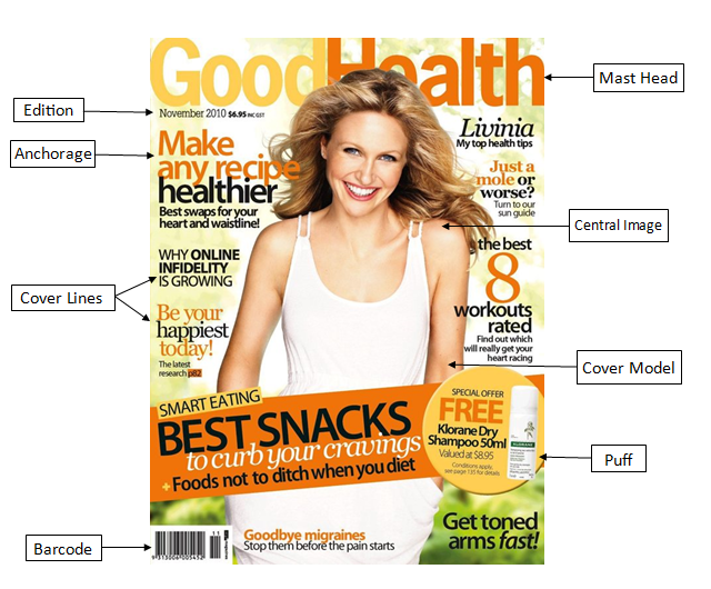
In our lesson yesterday, we learnt all of the features which are included in a magazine cover; these features are included in every single magazine cover and are known as a "convention". A convention is what's considered the "normal" or "common". Some examples of these conventions are the mast head, central image and tagline; these are all common in a magazine cover. The main purposes of these conventions are to attract a certain type of target audience and to persuade customers to buy the magazine. In the magazine industry, every centimetre of the magazine has to be used up to attract customers.
Firstly, the most important feature of a magazine cover is the mast head. This is the name of the magazine which is always placed at the top in huge, bold writing. Here are some examples of mast heads:
As you can see, the mast head for Kerrang is very noticeable as it is very big and it is what stands out the most in the magazine, in addition the colour of the mast head contrasts with the background so it is more visible to the costumer. Likewise for the Vogue magazine, the mast head is in bright red so that the costumer is more likely to see it.
Another convention which is very important to the front cover is the central image; this is the image that catches the readers' eye before reading the printed text. The central image has to be appropriate to what is inside the magazine because it will be featured in the main article. In addition to it's importance, it is most likely what will attract the customer to buy the magazine because the image will be very eye catching to a certain target audience.
As you can see, the central images on these magazine covers are very eye catching and will attract a certain audience. For example, the Fashion magazine includes a picture of a model wearing a trendy dress with the tagline "Spring shopping made easy". This will obviously attract a lot of female audiences who are interested in fashion or what is in the latest trends; this central image is chosen because it will make females feel like this is what they should look like, therefore they feel attracted to buy it. Likewise with the Men's Health magazine, the central image is chosen because it will attract male audiences to buy it because it is what they want to look like. Along with the tagline "Build a beach body", this will attract males to buy the magazine because it is engaging.
Another convention of a magazine is the tagline, which is usually found near the mast head. The tagline represents what the magazine is about and who it might be aimed for. For example, the tagline for Q magazine is "discover great music" which is just underneath the mast head. The customer will know that this magazine is aimed towards people who have a taste in music or for anyone who wants to find new music. Another example of a tagline is "Anime, Asian, Film, Manga, Games" for Neo magazine which will persuade anyone to buy the magazine if they like any of the things on the tagline. In my opinion, it is a good tagline because it presents what is included inside the magazine as well as attracting costumers to buy it.
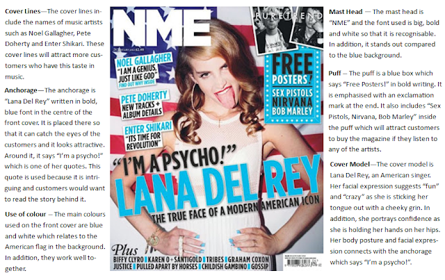
Other conventions of a magazine include anchorage, secondary images, coverlines, puffs and pugs. An anchorage is a term that refers to how images are referred to. In magazines, images will be anchored by captions (directly explaining what the pictures depict), by coverlines, or by articles and headlines. An example of anchorage is "The World's Greatest Actor" on the cover of Time magazine. This appeals to the audience because there is more context inside the magazine, so it will make them want to read it. Also, it is written in bold font and the word "greatest" is specifically highlighted in red so it is emphasised more.
The Digital Photographer magazine shown above contains a pug and puff. The pug is located at the top left corner of the magazine and the puff is a device which helps to draw attention and to promote certain elements in the magazine, this often advertises "freebies". The pug on the cover says "Free CD" which will automatically attract a customer to buy it as it is free, in addition the puff says "Plus! Restore old images" which connects to the pug. Both of these features are more techniques to persuade a customer to buy magazines.
Monday, 14 September 2015
My First Post.
Hello,
This is my first post. Media Studies is a very interesting subject which I enjoy, Mr Bohacek is a pretty rad teacher. I'm looking forward to doing the coursework because it seems enjoyable and different to all my other subjects.
Kanye for president 2020.
This is my first post. Media Studies is a very interesting subject which I enjoy, Mr Bohacek is a pretty rad teacher. I'm looking forward to doing the coursework because it seems enjoyable and different to all my other subjects.
Kanye for president 2020.
Subscribe to:
Comments (Atom)


